For pharmaceutical companies, crafting a website that hits the right note is crucial. A well-designed website can make complex info feel accessible, turn dry data into engaging stories, and help visitors find what they need without the hassle. So, what makes a pharmaceutical website stand out? Is it the clarity, the design, or how easy it is to navigate? We've scoured the internet to find the top 10 pharmaceutical websites that get all these elements right – they're the ones you'll want to bookmark, share, and return to.
1. Johnson & Johnson
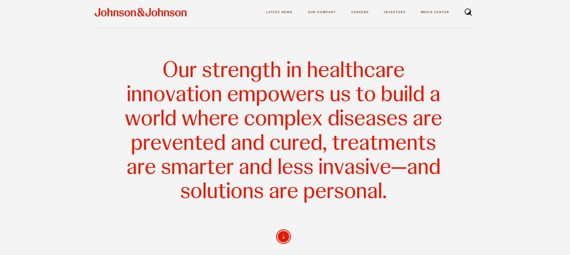
What Makes It Stand Out: Johnson & Johnson's website combines a crisp red and white palette with user-friendly navigation. Its interactive features and videos engage visitors, while the organized media center ensures easy access to the latest news, effectively reflecting the company's commitment to clarity and user engagement.
2. Merck

What Makes It Stand Out: Merck's website employs a clean and modern design, utilizing a color palette of teal, white, and black that reflects the company's brand identity. The website's clear layout makes it easy for visitors to quickly find the information they need. Noteworthy is the site's emphasis on imagery, which adds a dynamic and engaging element to the user experience. The menu is straightforward, offering quick access to crucial sections. The buttons and other interactive elements are strategically placed for enhanced visibility.
3. Roche

What Makes It Stand Out: This pharmaceutical website showcases an impactful video of smiling individuals that widens to span the entire site when scrolling, instilling a sense of comfort and trust associated with the brand. The design maintains a clean aesthetic, perfectly aligning with the site's pharmaceutical theme. Overall, it demonstrates robust branding and a seamless user experience.
4. AbbVie
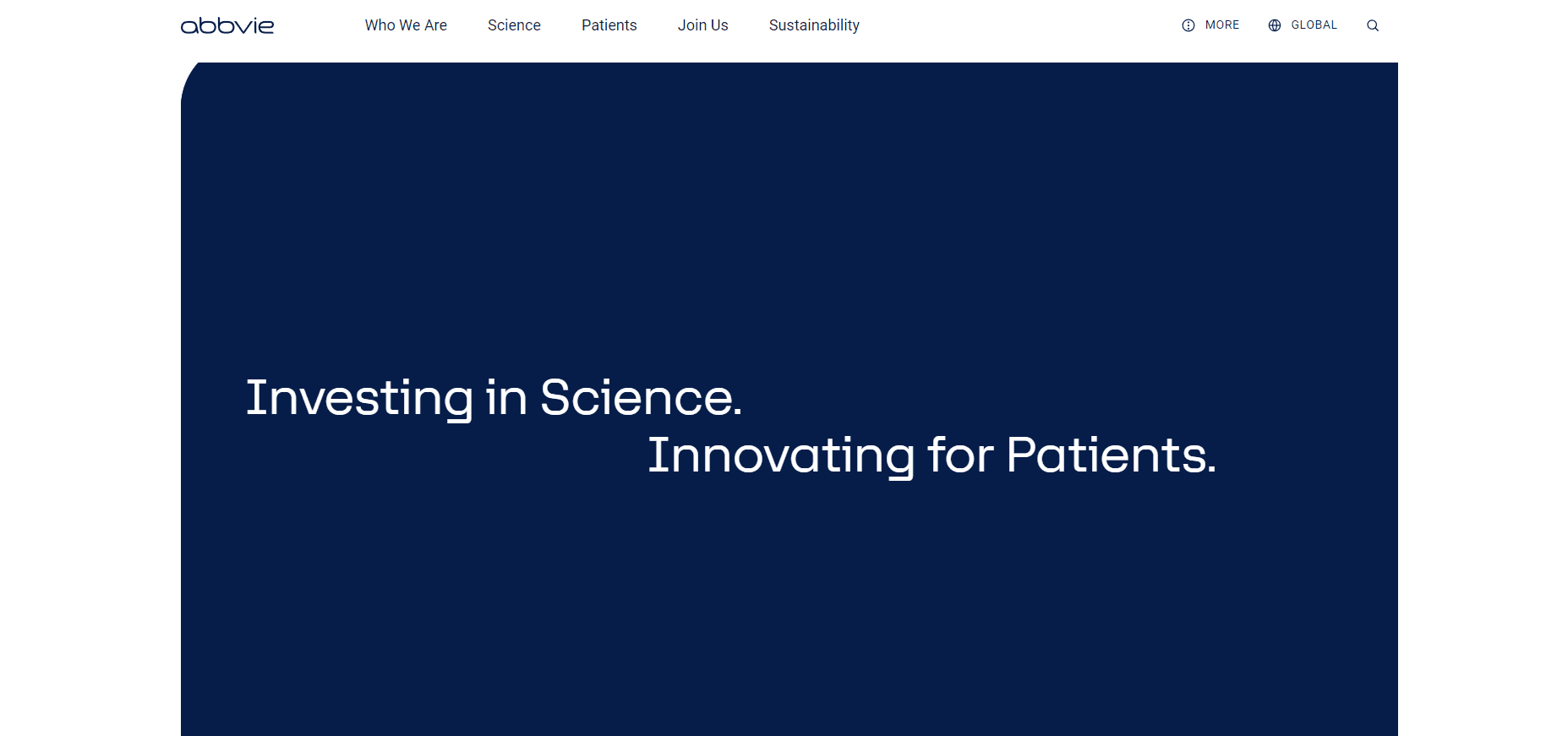
What Makes It Stand Out: Interactive features are strategically integrated throughout the site, guiding users smoothly from one section to another, while the bold color palette distinctly highlights key information and calls to action.
5. Akouos
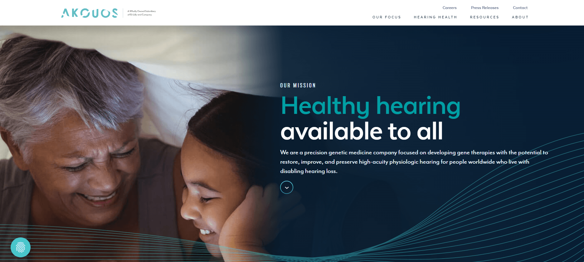
What Makes It Stand Out: The Akouos website showcases a consistent and appealing design, using a limited color palette to create a unified look that aids in seamless navigation. This design approach not only enhances the aesthetic appeal but also makes it straightforward for users to access detailed and up-to-date information on gene therapies for hearing loss.
6. novavax
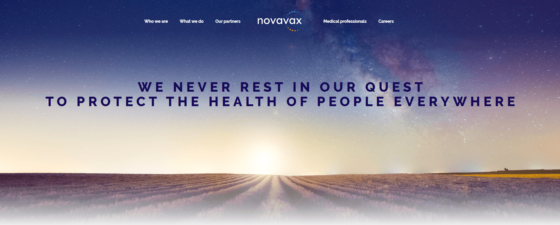
What Makes It Stand Out: Novavax's website uses eye-catching graphics and easy-to-understand infographics, making their vaccine research clear to everyone. The infographics are especially effective, helping visitors from all backgrounds quickly grasp complicated topics.
7. Inozyme
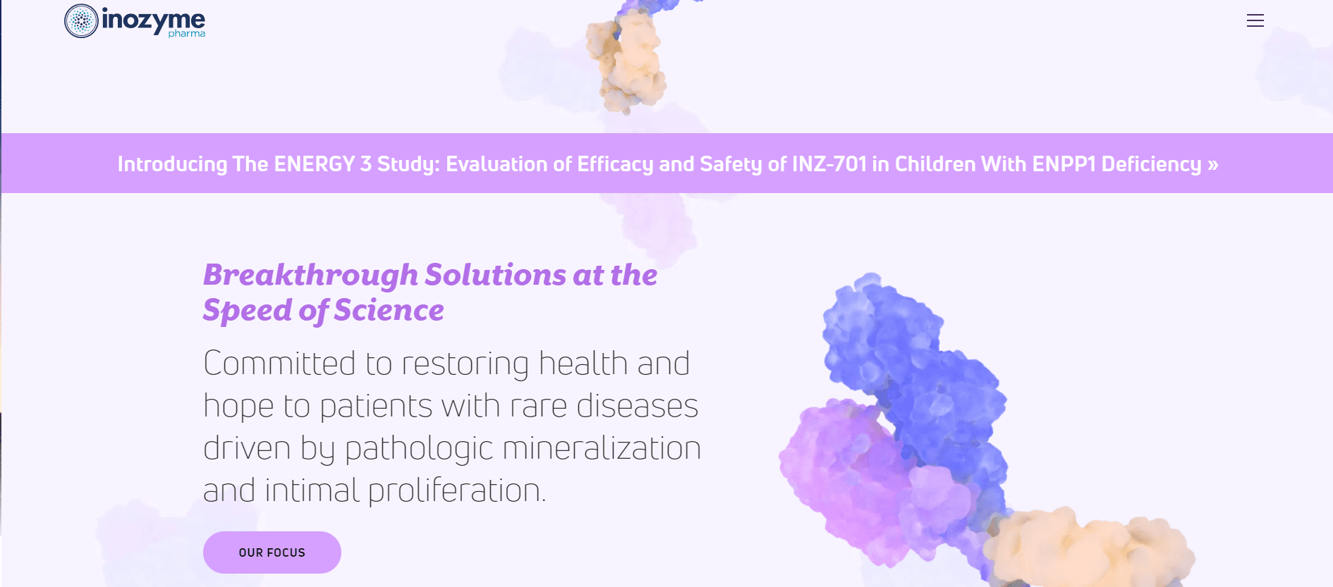
What Makes It Stand Out: Inozyme stands out from the usual pharmaceutical websites with its unique pastel color scheme, making navigation smooth and enjoyable. The site is well-organized, offering easy access to treatment information, all presented with visually appealing designs.
8. Ironshore Pharma
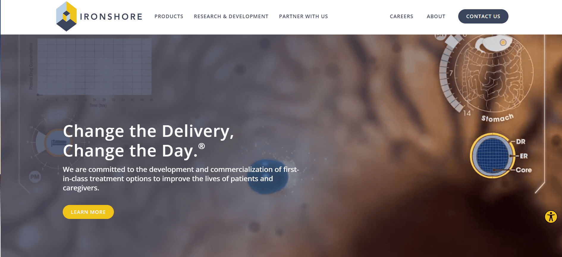
What Makes It Stand Out: Ironshore Pharma's website captivates with its exceptional, bespoke graphic design and intuitive structure, clearly communicating its goal to improve patient care with novel, patient-centric therapies. The website is designed for easy exploration of their core values, demonstrating a dedication to enhancing health results for both patients and caregivers. It features animations, unique graphics, video backgrounds, and interactive components.
9. Biogen
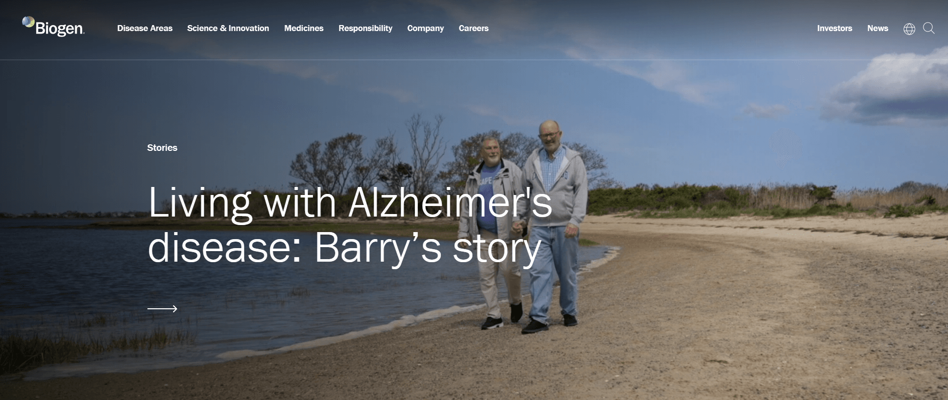
What Makes It Stand Out: Biogen's website excels in its focus on the user, providing interactive features, resources for patients, and compelling narratives about the benefits of their treatments. Simple yet powerful videos on the site effectively convey their message through the expressive reactions of the main character.
10. Vertex
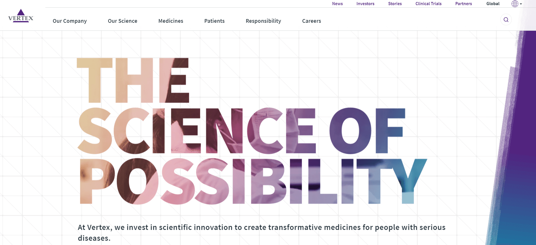
What Makes It Stand Out: Vertex Pharmaceuticals's website features a modern design that highlights their innovative cystic fibrosis treatments and commitment to patient well-being. The site stands out with a background video behind the header text, adding a dynamic touch. It's also easy to navigate, offering interesting content from start to finish.
We've curated a selection of the top 10 pharmaceutical websites to inspire you. These sites represent leading companies in the pharmaceutical industry, showcasing their innovations in areas like drug development, patient care, and medical research. They employ top-notch web design and development standards to effectively communicate their missions and engage their audiences. Our goal is to ignite your creativity and offer fresh ideas for promoting your company's work or products online. Whether you're looking to enhance your existing website or starting from scratch, we can create a custom mockup of your new site before any commitment or payment from your side.
