In today’s digital-first world, your wealth management website is often your first impression—and your biggest opportunity. Prospects are judging your credibility, clarity, and capability in seconds. The right design builds trust. The wrong one? It sends them searching elsewhere.
That’s why we created a free Wealth Management Website Template in Figma — inspired by top-performing sites and built to help firms like yours stand out, convert better, and win trust faster. It’s yours to explore, adapt, and use.
In this guide, we’ve also curated 10 of the best wealth management website design examples—sites that get it right when it comes to client experience, design clarity, and digital polish. Whether you’re planning a redesign or just looking for inspiration, these examples reveal what’s working now and what clients expect next.
Because in a category built on trust, how you show up online is everything.
1. Deploi - Wealth Management Figma Template
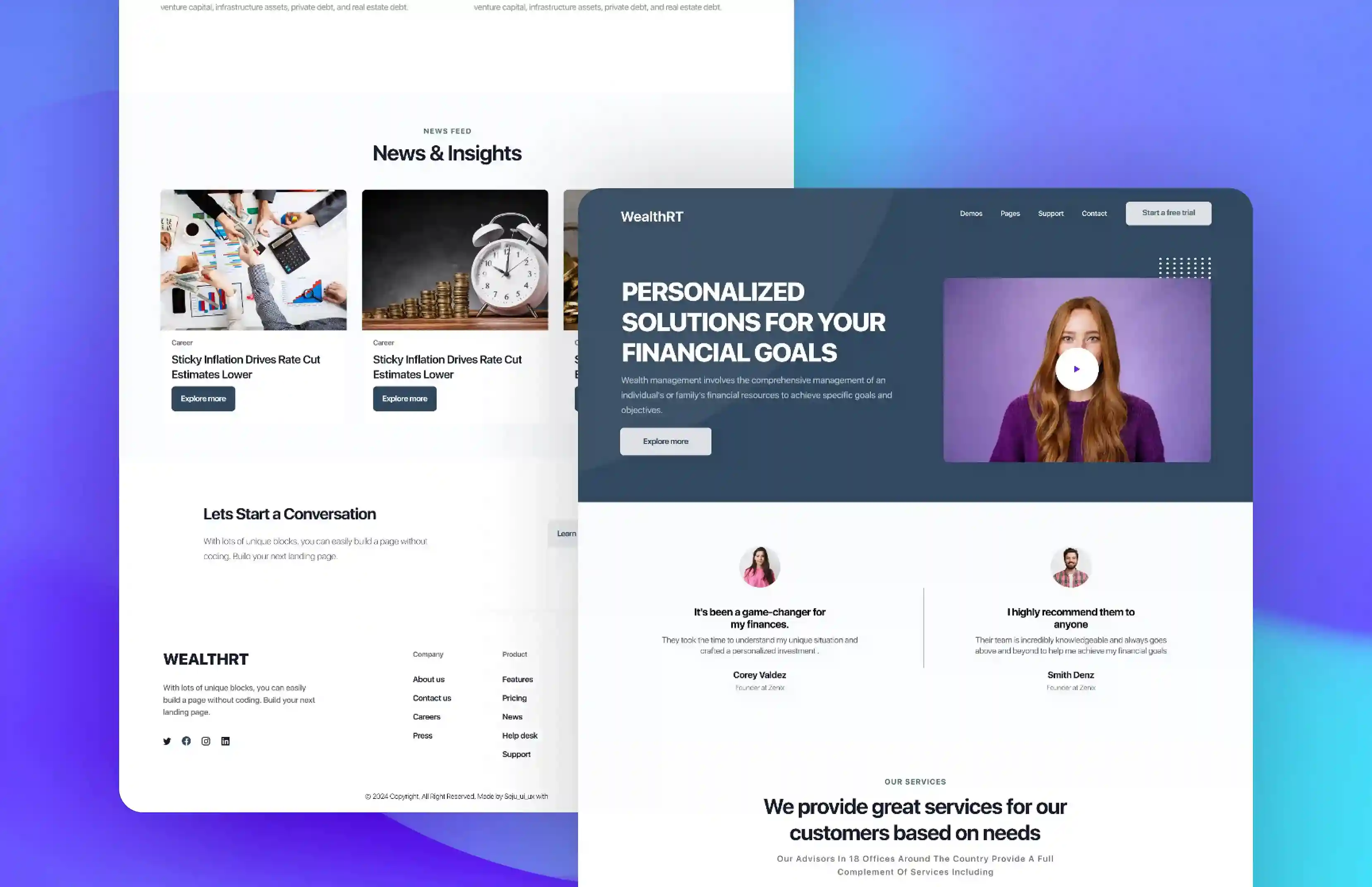
A great wealth management website should make visitors feel confident, informed, and ready to engage. That’s the thinking behind this free Figma template by Deploi — designed to help firms build trust faster through clean design, clear messaging, and a seamless user journey.
Inspired by top-performing wealth sites, this template gives you a modern foundation you can adapt to your brand. And if you’re looking to optimize for action, we’ve also created a separate Figma file with 15 customizable CTAs built specifically for savvy wealth management firms.
2. Nicola Wealth
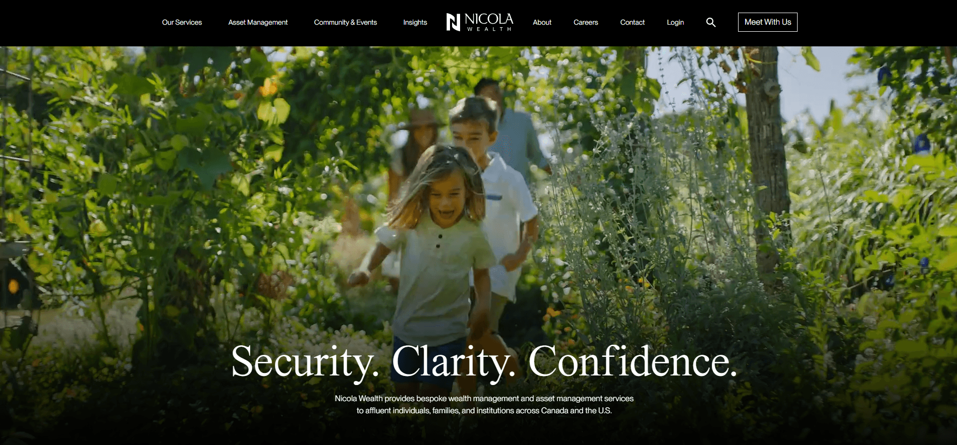
Standout Features: Nicola Wealth secures the top spot on our list with a compelling homepage video showcasing a smiling family. This perfectly encapsulates the themes of security, clarity, and confidence highlighted in their tagline. The website also impresses with its use of engaging pie charts and graphics, presenting essential information in an accessible and visually appealing manner, underscoring why it earns its premier position.
3. Aspiriant
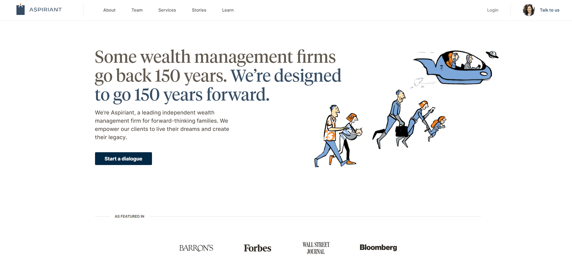
Standout Features: The design effectively utilizes white space to create a clean and clear layout, emphasizing essential elements and enhancing readability. It skillfully integrates the brand's narrative, offering an engaging and emotionally resonant experience. Additionally, the illustrations are genuinely heartfelt, contributing significantly to the overall impact.
4. Harness Wealth
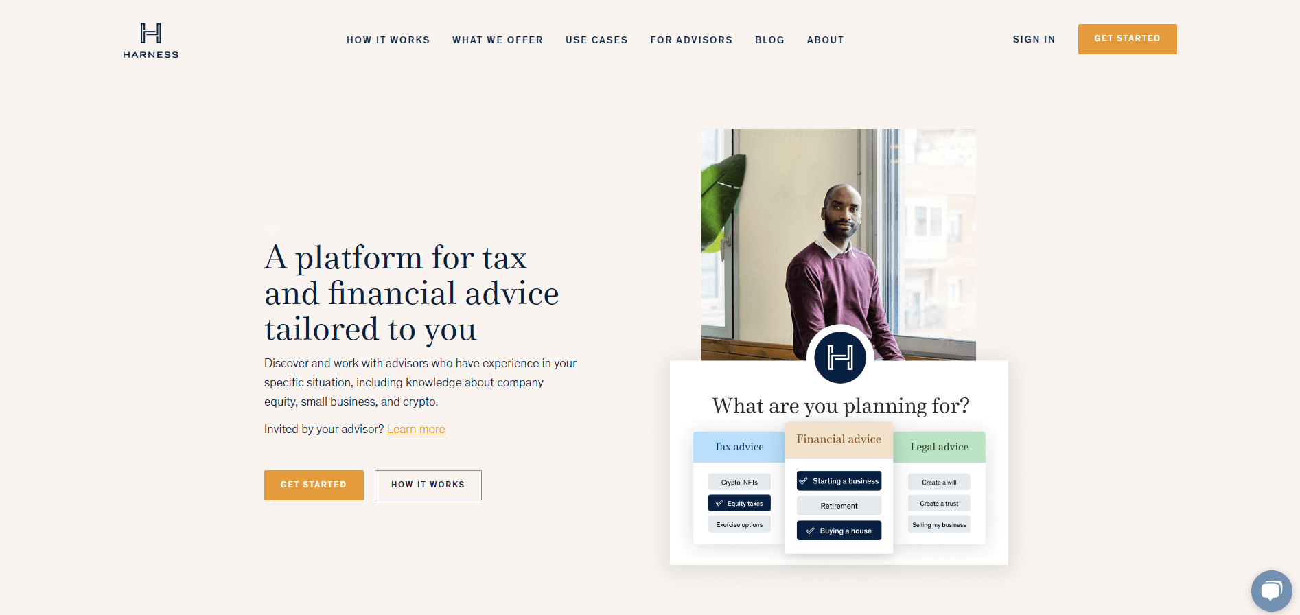
Standout Features: The site's user interface is clean and uncluttered, focusing on important content. The use of contrast enhances legibility and effectively draws attention to critical areas. Additionally, including a chatbot simplifies navigation for visitors, making it easier to access specific sections. The website's refreshing color palette contributes to setting a positive tone.
5. Wealthspire
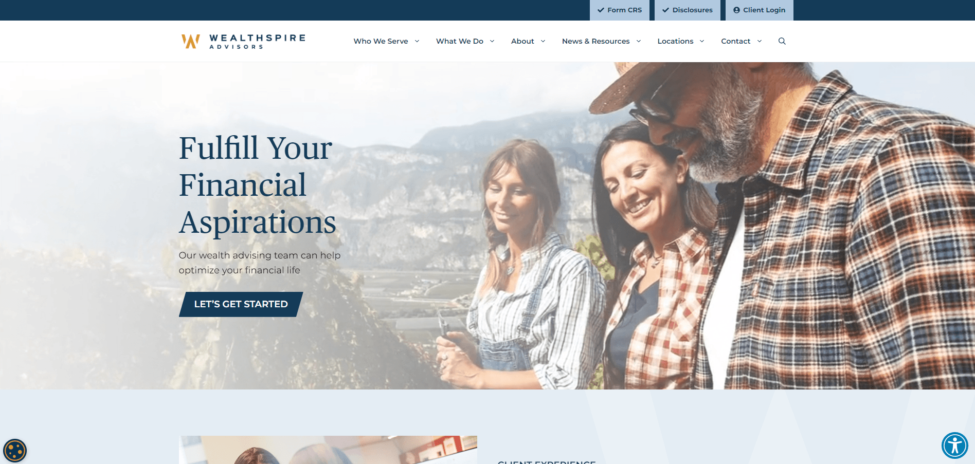
Standout Features: The site features an interactive advisor for visitors, a rare but intriguing element that significantly enhances user engagement. Additionally, the subtle yet effective hover effects on links and buttons provide immediate feedback, boosting interactivity. The well-structured approach to content hierarchy ensures that the site's key messages are prominent and easily discernible.
6. Blue Trust
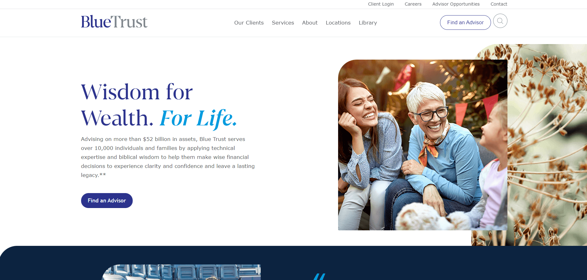
Standout Features: The inclusion of social proof elements, such as testimonials and reviews is well-executed, effectively building credibility and trust with visitors. Furthermore, interactive elements are seamlessly integrated, enhancing user engagement without overwhelming or detracting from the main content. The design also skillfully incorporates the layering of images, colors, and shapes, adding depth and interest to the visual experience.
7. Tanager Wealth Management
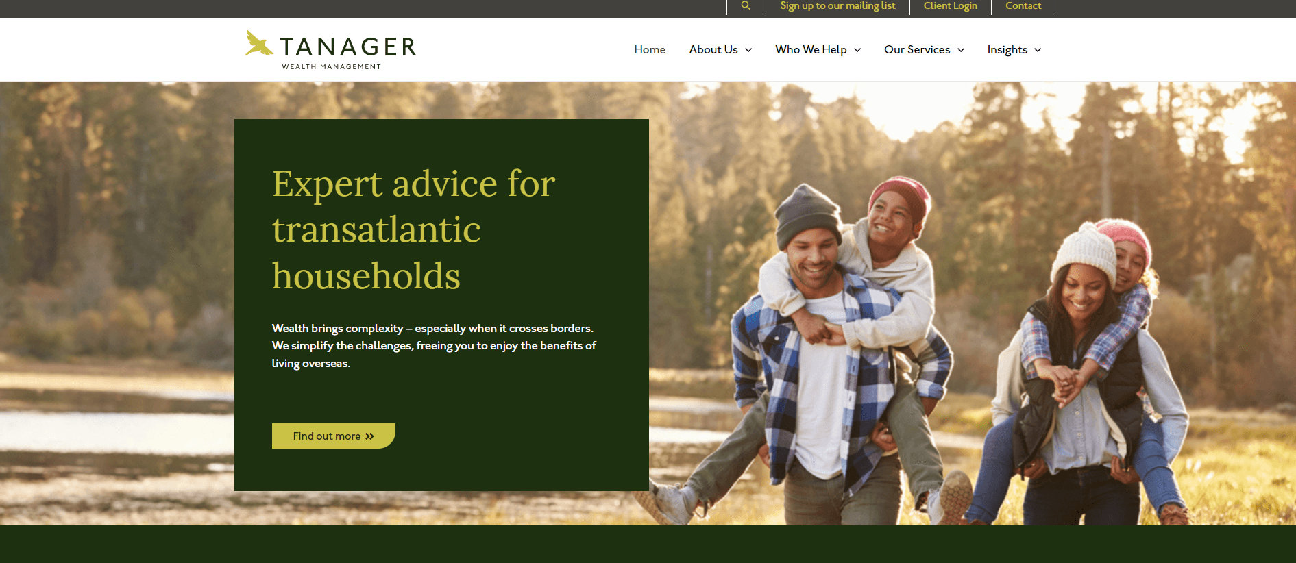
Standout Features: The earthy tones color scheme enhances the site's visual appeal and aligns seamlessly with the brand's identity. The selection of images is outstanding, adding interest and effectively supporting the text. Furthermore, a simple, user-friendly contact form encourages visitors to engage and connect.
8. Baseline Wealth Management
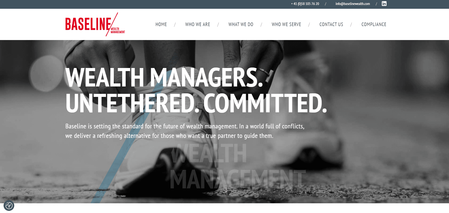
Standout Features: The website's intuitive layout ensures easy access to information, with essential elements from the menu bar prominently displayed on the homepage. Effective contrast enhances legibility and focuses on critical areas, while the balance between visual and textual content is expertly maintained.
9. Carson Wealth
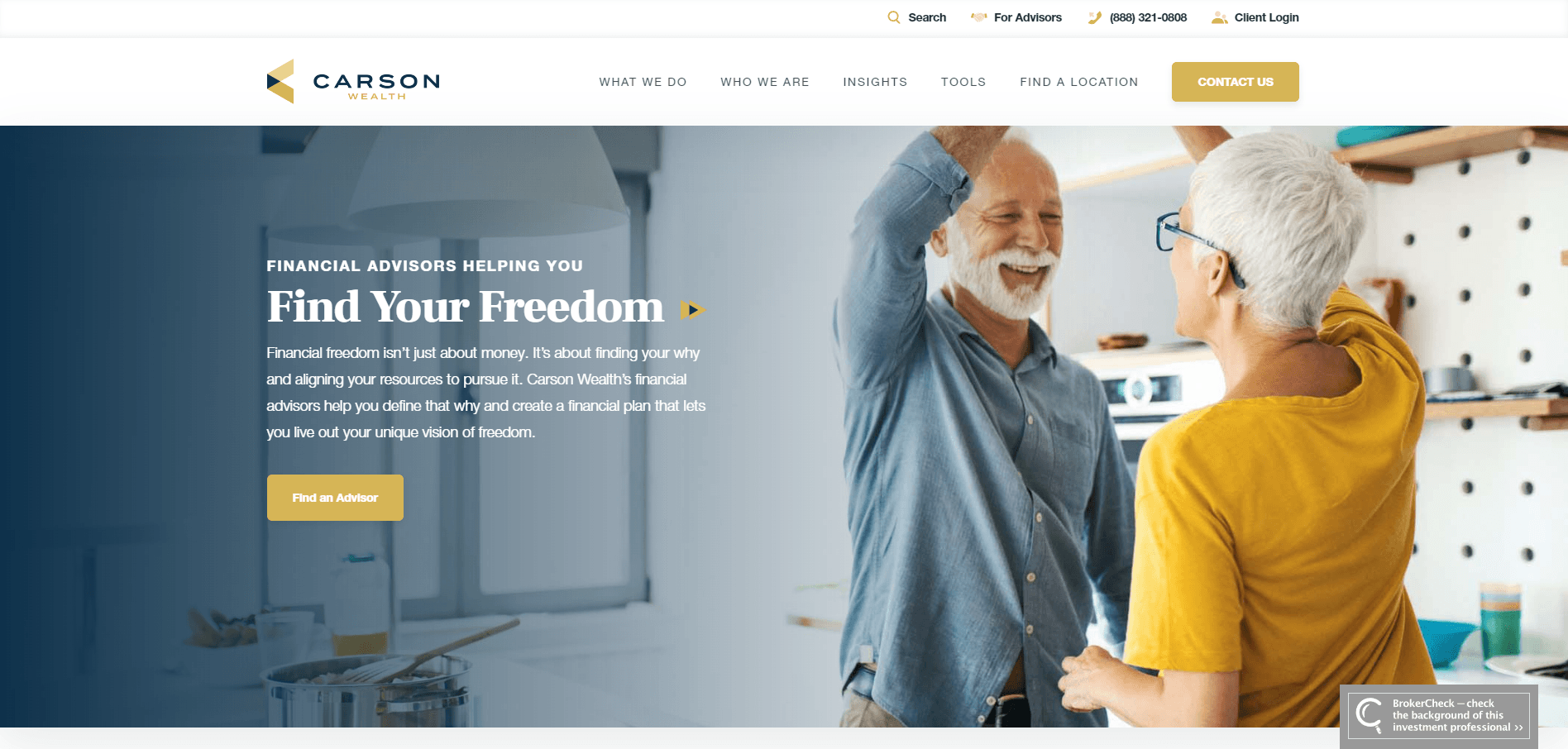
Standout Features: This interactive website features a Retirement Readiness Quiz that engages users by assessing their preparedness for retirement. The quiz provides insights that align with their goals and fosters a sense of inclusion in the brand's experience. It boasts bright colors and consistent buttons and icons, enhancing the user's journey and interaction with the site.
10. Goldman Sachs
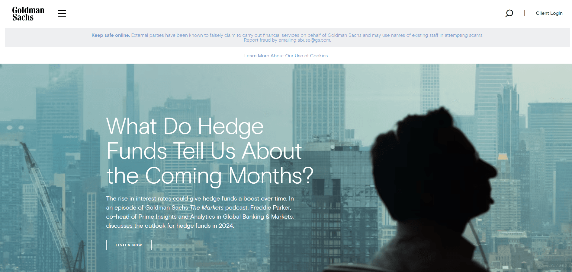
Standout Features: The site showcases an exciting choice of colors that enhance its visual appeal. As you scroll, elements subtly pop up, complemented by image layering, creating an engaging user experience. The minimal text contributes to the site's visual appeal, and the subtle hover effects add a refined interactive element.
11. BNY Mellon Wealth Management
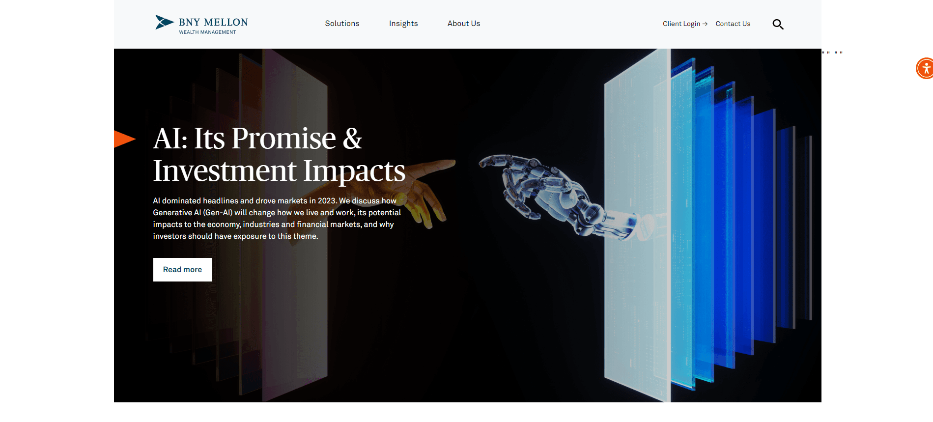
Standout Features: The design is minimalistic and sophisticated, emphasizing the power of AI. It features a retractable menu, enhancing the presentation's simplicity and accessibility. This effectively showcases the brand with minimal information yet significant impact.
We've explored the finest wealth management website designs for 2024. Each exemplifies how strategic design can enhance client engagement and convey a firm's ethos. These websites blend aesthetics with functionality, providing clients with clarity and confidence in their financial decisions.
Consider these examples to understand how design influences perception and interaction in the wealth management sector. Feel free to use these examples to shape a digital presence that stands out in the industry and connects with your audience.
