In 2025, the landscape of bank website design is essential for connecting with customers. In this guide, we've meticulously researched and compiled the best bank website design examples, focusing on aesthetics and how these designs enhance user experience and security. We've thoroughly explored numerous websites to handpick those that excellently balance design with functionality, ensuring they're visually appealing, user-friendly, and secure for customers.
This selection aims to give you a clear view of how banks are innovating online to meet customer needs effectively. So, whether you're in the banking industry looking for design inspiration or simply curious about top-notch bank website designs, our list is tailored to provide valuable insights and actionable steps, ensuring you get to the "good part" right away.
1. EQ Bank
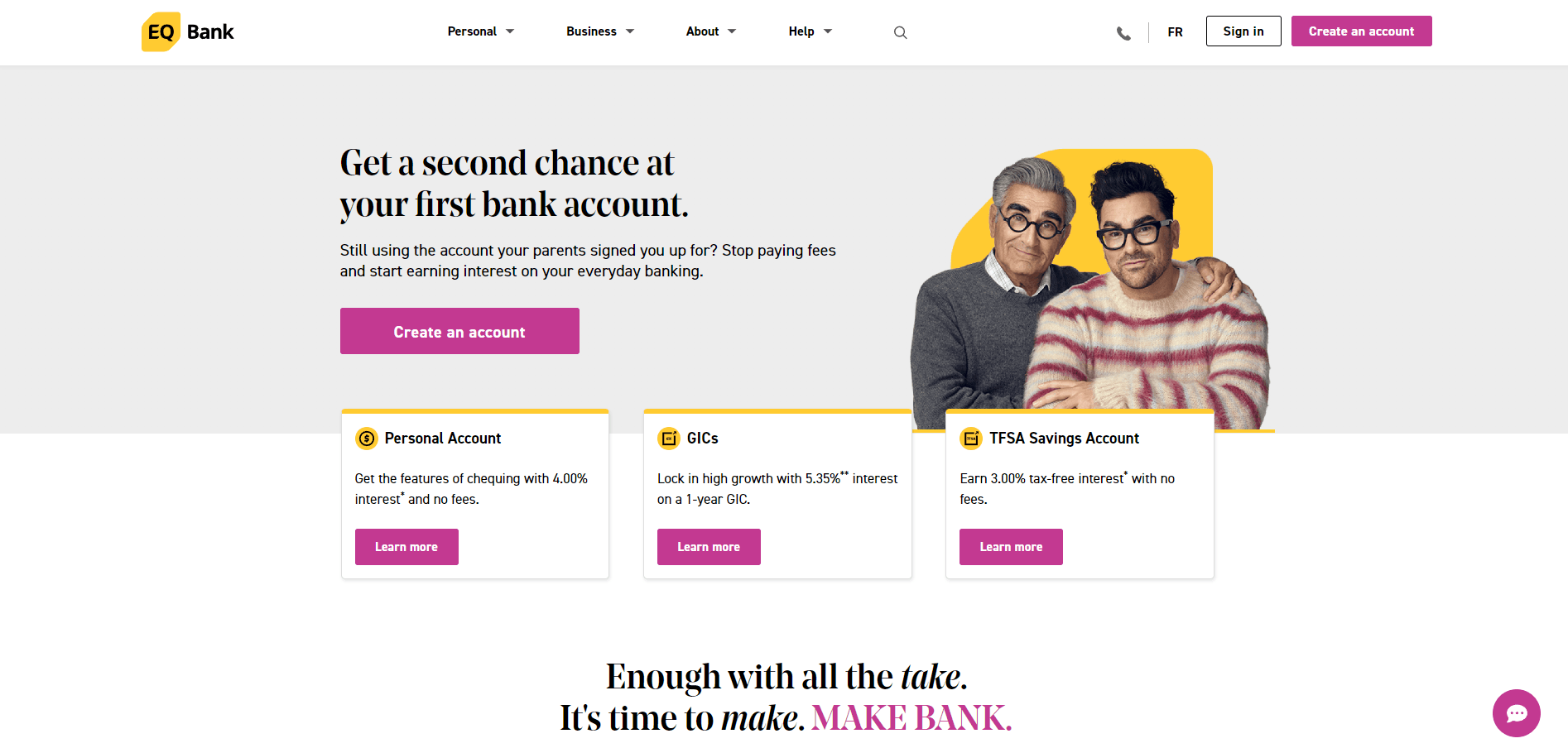
What Makes It Stand Out: First and foremost on our list, and rightfully deserving, is a website distinguished by its stylish yet readable font choice, which enhances the user experience. Its theme is consistent and memorable, reinforcing brand recognition. Furthermore, the website's expert use of space strikes a perfect balance between content density and aesthetics, creating a pleasant visual flow that engages the user.
2. Tangerine
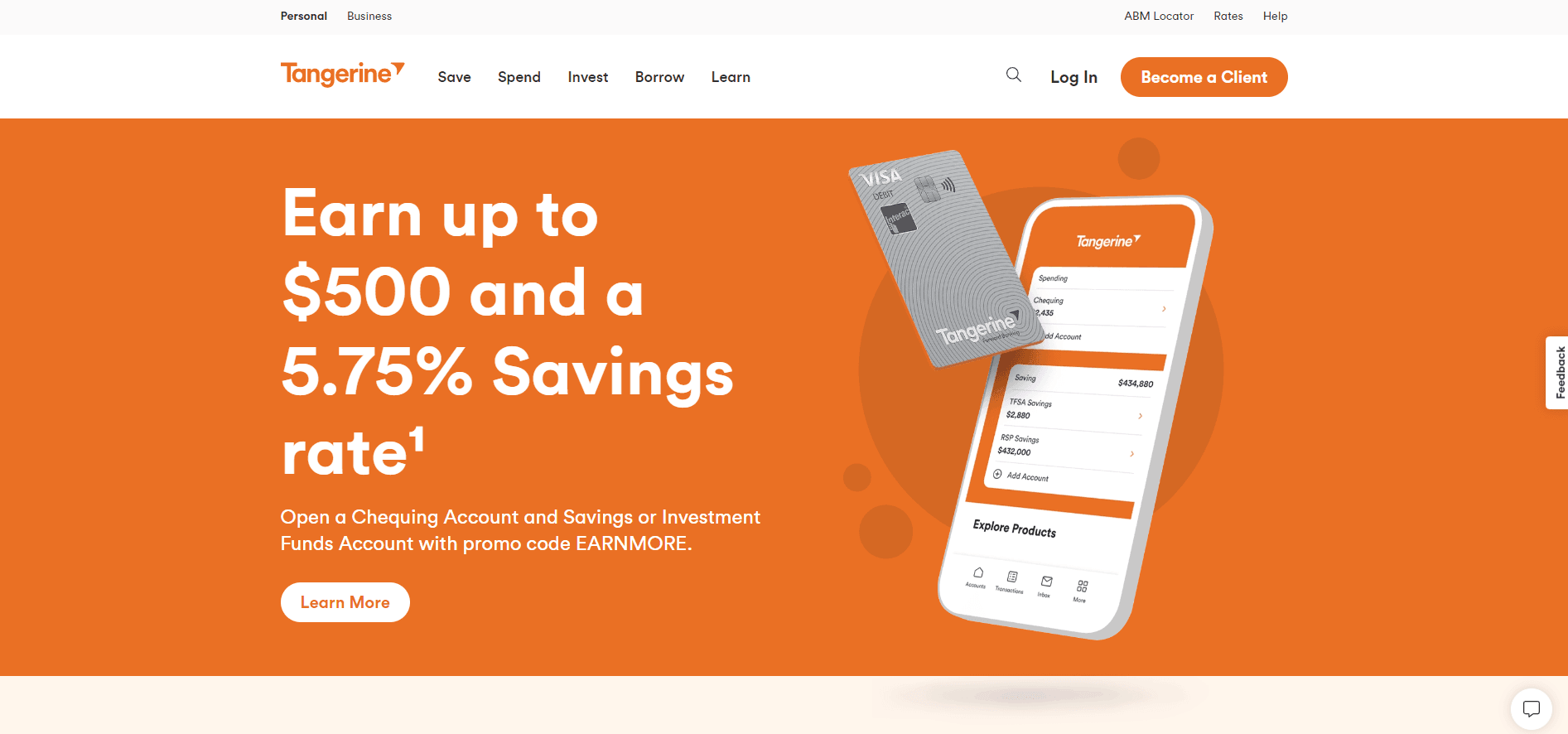
What Makes It Stand Out: The website's card layout is meticulously designed to be clean and organized, providing users with a clear and intuitive structure that simplifies content digestion. This design choice enhances the user experience by making information easily accessible and understandable. Additionally, including interactive hover effects on the cards introduces an engaging layer of interactivity, capturing users' attention and encouraging further exploration.
The site employs a thoughtful contrast between text and background colours to complete this, significantly enhancing readability and ensuring accessibility. This careful attention to detail in design elements makes the site visually appealing and fosters a more inclusive and user-friendly digital environment.
3. N26
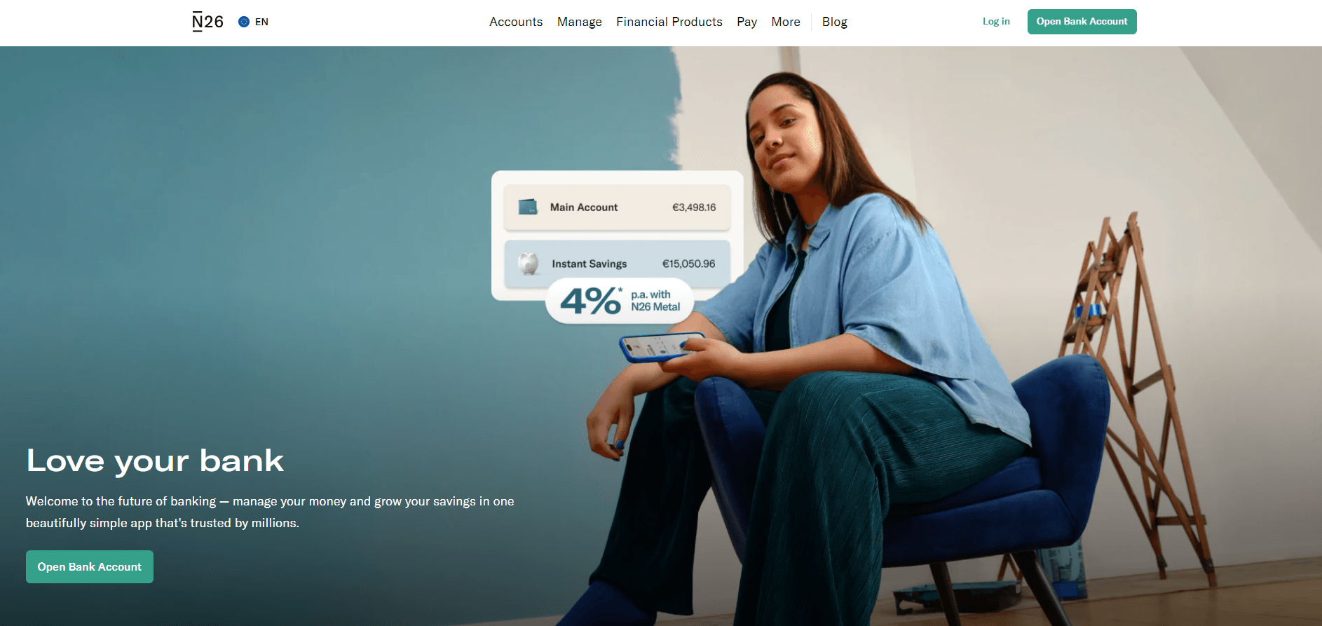
What Makes It Stand Out: The site's aesthetic appeal and user-friendly design demonstrate a keen eye for visual harmony and ease of navigation. Its thoughtfully chosen colour palette contributes to an inviting and cohesive visual experience that resonates with users. The menu's simplicity and cleanliness further accentuate the site's elegance, ensuring users can effortlessly navigate the various sections.
A standout feature is the prominent teal "Open Bank Account" button. Its size, colour, and positioning draw attention and make it easy for users to take a key action seamlessly. Overall, the site masterfully combines aesthetic design with functional clarity, making it a delightful digital experience for visitors.
4. Scotiabank
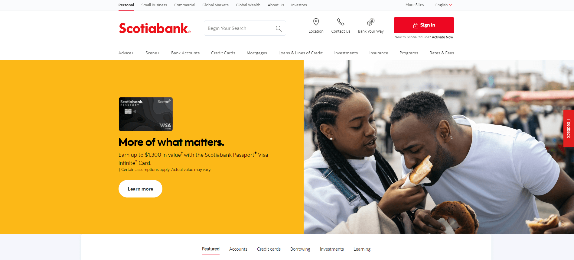
What Makes It Stand Out: Scotiabank's website showcases a clean design with well-organized and accessible information. The comprehensive menu efficiently provides all necessary links, ensuring a smooth user experience. Minimalistic design elements prevent distractions, creating a focused and perfect browsing environment.
5. CIBC
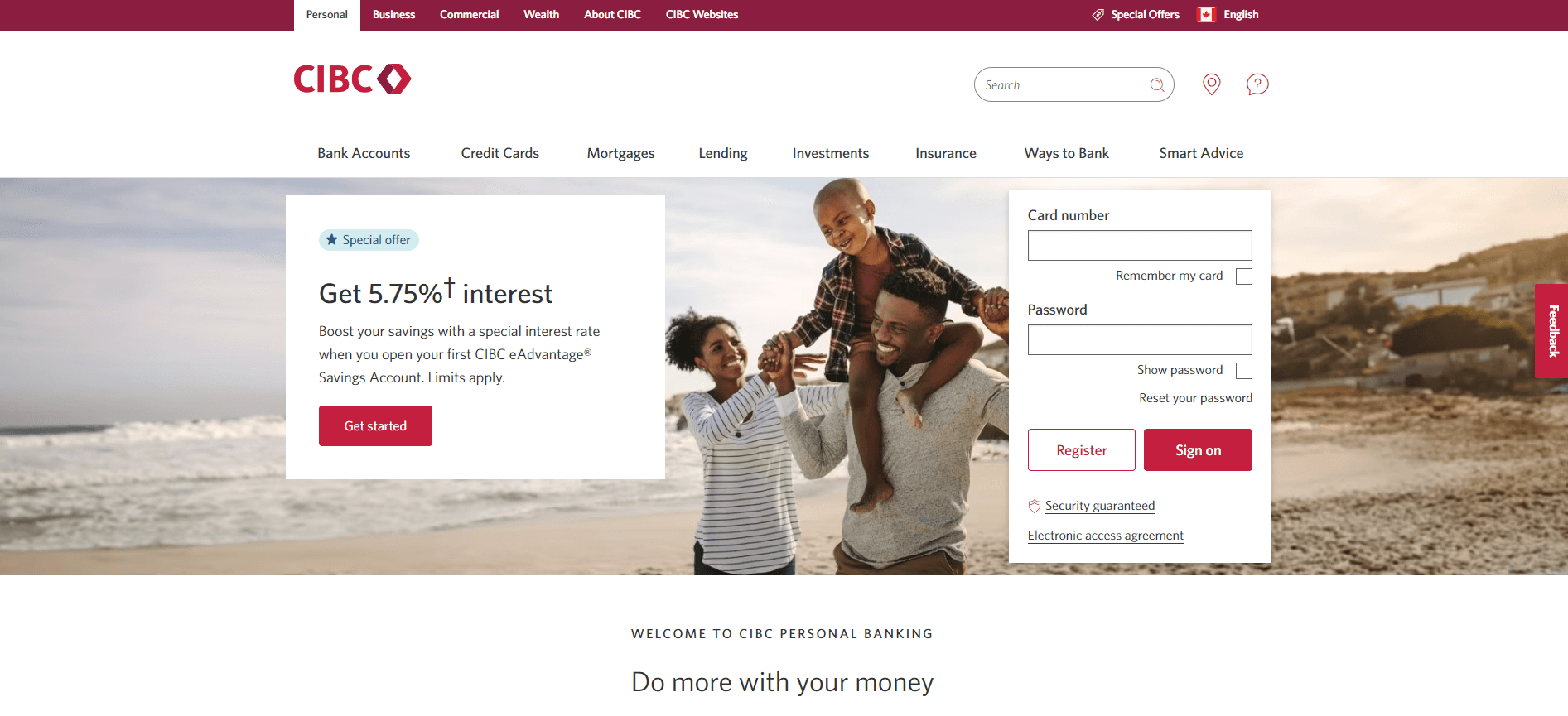
What Makes It Stand Out: The design is simple yet professional, effectively organizing large amounts of information into easy-to-digest sections. The Quick Links section enhances navigation, and the use of emotionally resonant images adds a genuine touch, making the site not only functional but also visually engaging. Additionally, the overall aesthetic and user-centric design elements work harmoniously to create a seamless and inviting user experience.
6. Heritage Bank
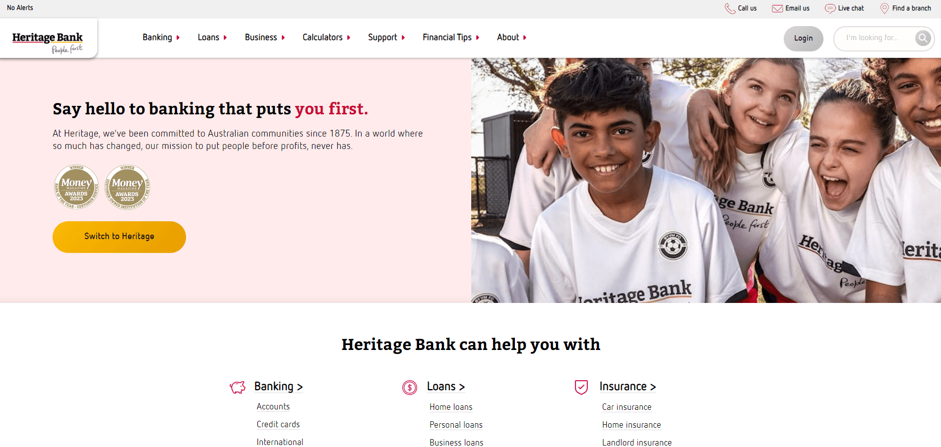
What Makes It Stand Out: The website design efficiently communicates what the bank offers just below the fold, eliminating the need for excessive scrolling to uncover the range of services provided. Subtle hover effects and thoughtfully selected visuals enhance the user experience, making information discovery not only intuitive but also visually appealing. This design approach ensures that users can quickly grasp the bank's offerings, reflecting a user-centric design philosophy.
7. Allica Bank
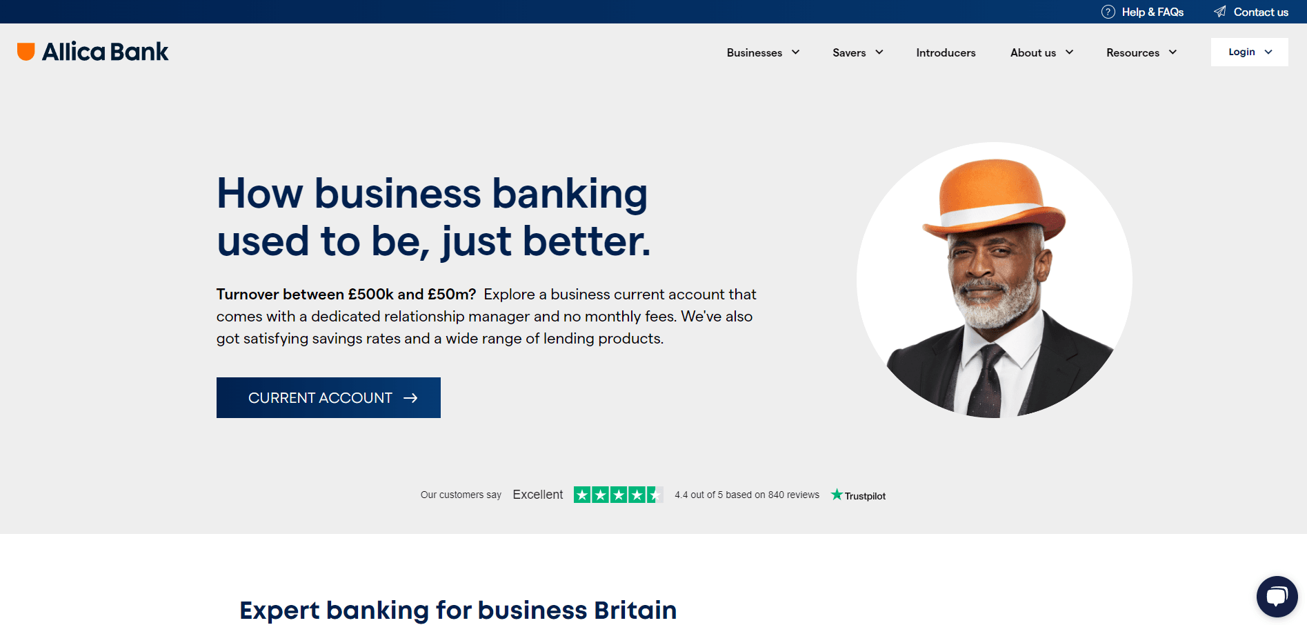
What Makes It Stand Out: The website features dynamic, floating customer reviews towards the bottom of the homepage, adding a lively element that captures attention. The design incorporates interesting shape layers that complement the overall aesthetic, enhancing the visual experience.
A notable feature is the business savings accounts section, which, upon hovering, changes contrast colours, providing a clear and engaging way for users to interact with critical information. This thoughtful design choice not only improves usability but also adds a layer of sophistication to the site's navigation.
8. Wealthsimple Cash
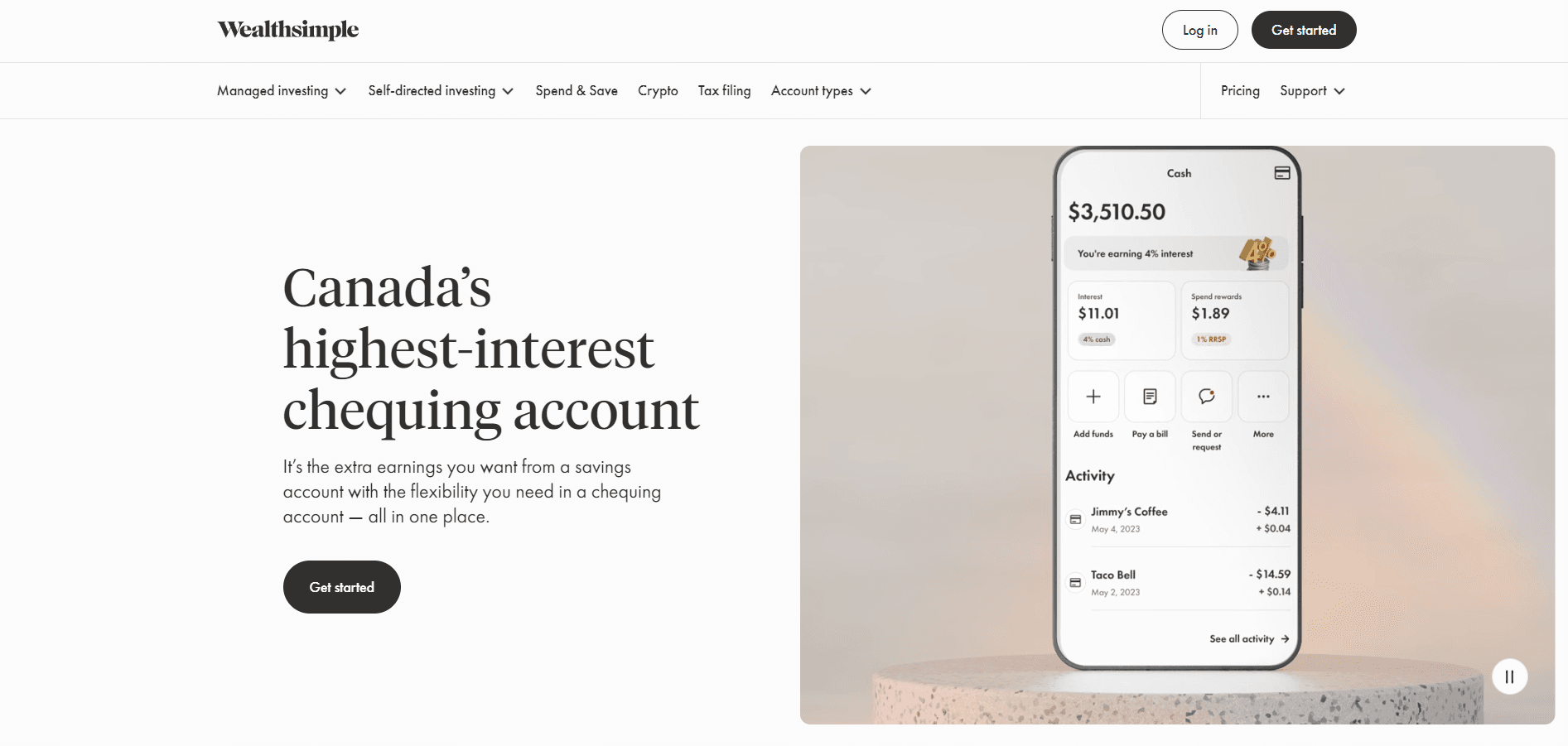
What Makes It Stand Out: Although not a traditional bank, this site merits inclusion for its exceptional design. It boasts solid animations and interactivity that significantly boost its visual appeal. Content is distilled to its essence, embracing a minimalist approach. The user experience is distinctly modern and tactile, offering a cutting-edge feel throughout the site. This blend of minimalism and advanced interactivity provides a fresh and engaging online experience.
9. Wise
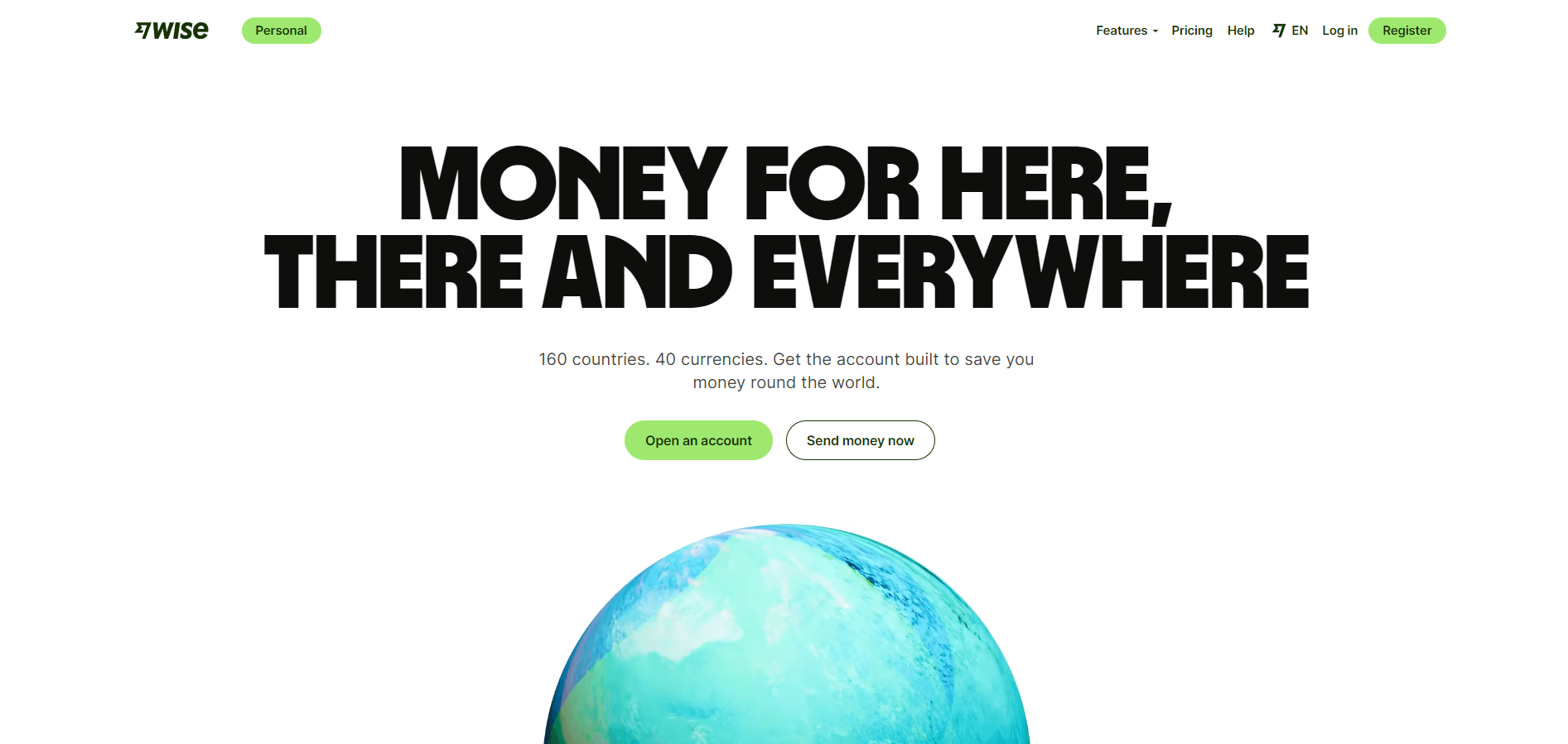
What Makes It Stand Out: Wise, though not a typical bank, stands out with its exceptional website design. The disappearing cards feature, showcasing reviews from globetrotting users who benefit from their services worldwide, is particularly impressive.
Additionally, the inclusion of a calculator for sending and receiving money directly on the homepage exemplifies transparency, informing users clearly about the details of their transactions. This feature dramatically enhances user awareness and trust. Overall, Wise's website combines excellent design with accessibility, making it easy for users to navigate and utilize its services efficiently.
10. Revolut
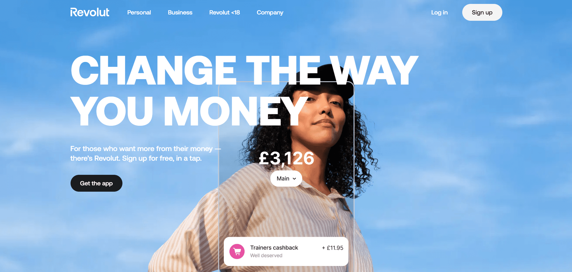
What Makes It Stand Out: Although Revolut's website does not represent a traditional bank, it undoubtedly deserves a spot for its groundbreaking design. Its dynamic and creative approach stands out, featuring animations that captivate and engage. This innovative design sets Revolut apart, showcasing how non-traditional financial platforms can redefine user expectations and experiences in the digital realm.
In conclusion, this curated list showcases various websites from banking entities that have pushed the boundaries of digital design in the financial sector. Each website, from Scotiabank's organized simplicity to Wise's transparent functionality and Revolut's creative dynamism, exemplifies how thoughtful design can transform the user experience. These platforms go beyond aesthetics, integrating interactive features, minimalistic content, and user-centric functionalities that enhance navigability and foster trust and engagement.
Including these non-traditional banks highlights a broader industry trend towards more innovative, accessible, and user-focused online experiences, setting new benchmarks for what users can expect from financial websites. Through their exceptional designs, these entities demonstrate that even the most conventional sectors can offer fresh, engaging, and inclusive digital experiences with the right design approach.